Most startup websites look great and feel modern, yet many of them still fail to convert. They do not convince anyone. They do not build trust. They do not create action.
And it is rarely because the product or idea is bad. It is usually because the story is not clear.
People do not have time to figure out what you do. If the value is not obvious within a few seconds, they leave. I see this every day when founders ask me to fix their website. The real issue is not design. It is direction, structure, and how the message lands.
Websites that convert do not rely on clever tricks or animations. They rely on clarity, trust, and a simple narrative that guides someone from “I understand what this is” to “I trust this” to “I want this.”
Here is the framework I use.
1. Start with a crystal-clear headline
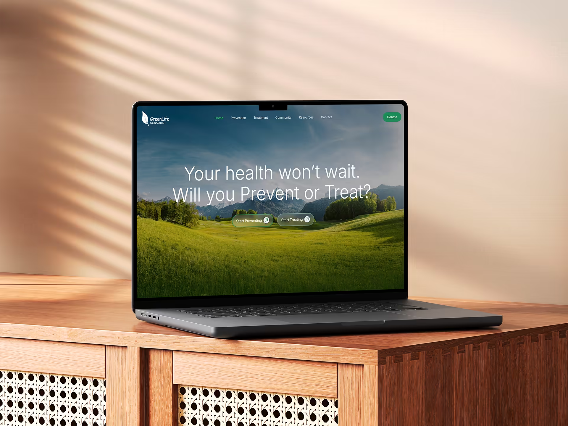
Your headline should state exactly what you do, who it is for, and what the outcome is. No guessing and no metaphors. Clarity is your biggest advantage in the first second.
2. Use a subheadline that gives context
Follow your headline with a short sentence explaining the problem you solve and why it matters. People need orientation before they commit attention.
3. Make your positioning unmistakable
Positioning matters because of the framing effect. The way you frame your approach shapes how someone interprets everything after it.
Most websites only describe what they do. Strong positioning explains how you do it differently and why that difference matters.
Example:
Two agencies say they build high-quality websites. They sound identical.
But if one says they build websites focused on clarity, trust, and conversion instead of design alone, the strategic angle becomes obvious.
Good positioning sets expectations, filters who you are for, and helps visitors see the page through the right lens. When your worldview matches theirs, they keep reading.
4. Anchor trust immediately using micro-proof
Because of the anchoring bias, the first thing visitors see shapes everything that comes after it. This is why the hero section needs at least one small trust cue.
Examples:
• A few client logos
• A short testimonial
• A rating
• A simple credibility line
These signals quietly tell the visitor that others trusted you and had a good experience. That is enough to make people comfortable enough to continue.
5. Expand trust before introducing detail
Once someone scrolls, they look for proof that supports their first impression. This is the confirmation bias at work. This is where macro-proof belongs.
Examples:
• Case studies
• Before and after results
• Testimonials
• Screenshots
• Metrics
Putting proof early builds momentum and makes people more willing to explore the rest of the page.
6. Reduce choice to increase action
Navigation seems small, but it affects conversions more than most founders realize. When you give people too many choices, they hesitate. This is the paradox of choice. Too many paths create uncertainty and uncertainty kills action. A focused navigation helps visitors understand where to go next.
Example of clean navigation:
• Work
• Services
• About
• Contact
Each item has a purpose. Less noise creates more movement.
7. Use CTAs that guide people forward
Clear CTAs work because of the action bias. People move forward more easily when the action is simple and well-defined.
Examples:
• See how it works
• Get the full overview
• Start your first step
Avoid vague CTAs like “Learn More.” They do not communicate value or direction.
8. Add a trust-building section only when you have no proof yet
Not every homepage needs a founder story. But early-stage startups without testimonials or results need a way to build trust. A short section about your background or your reason for building the product can help.
This works because people trust people they understand. Once you have real proof, use that instead.
9. Break down your offer in a way that reduces risk
People rarely hesitate because they dislike the service. They hesitate because they do not know what will happen next. This is ambiguity aversion. The brain avoids unclear outcomes. A clear process removes uncertainty.
- Clarity call
- Structure and messaging
- Wireframes
- Build
- Launch
This shows that the process is predictable, not open-ended. Predictability creates trust.
10. End with a clear, simple CTA
A good CTA makes the next step feel easy and logical. The most effective ones use simple action words, feel low-commitment, and match the story the page has told so far.
A strong CTA:
• uses an action verb
• feels manageable
• stays aligned with the message
When the next step is obvious, people take it.
.avif)
.avif)

