Red Parrot Coffee — From Flat Design to Full Flavor
When a Great Brand Doesn’t Feel Like One
Red Parrot Coffee had everything — great beans, bold packaging, and a loyal audience. But their old website didn’t match that energy. It looked flat, lacked warmth, and made ordering harder than it should be. The visuals felt disconnected from the brand’s cool, vibrant identity, and the flow confused customers instead of guiding them. The problem wasn’t the coffee, it was how the story was told online.

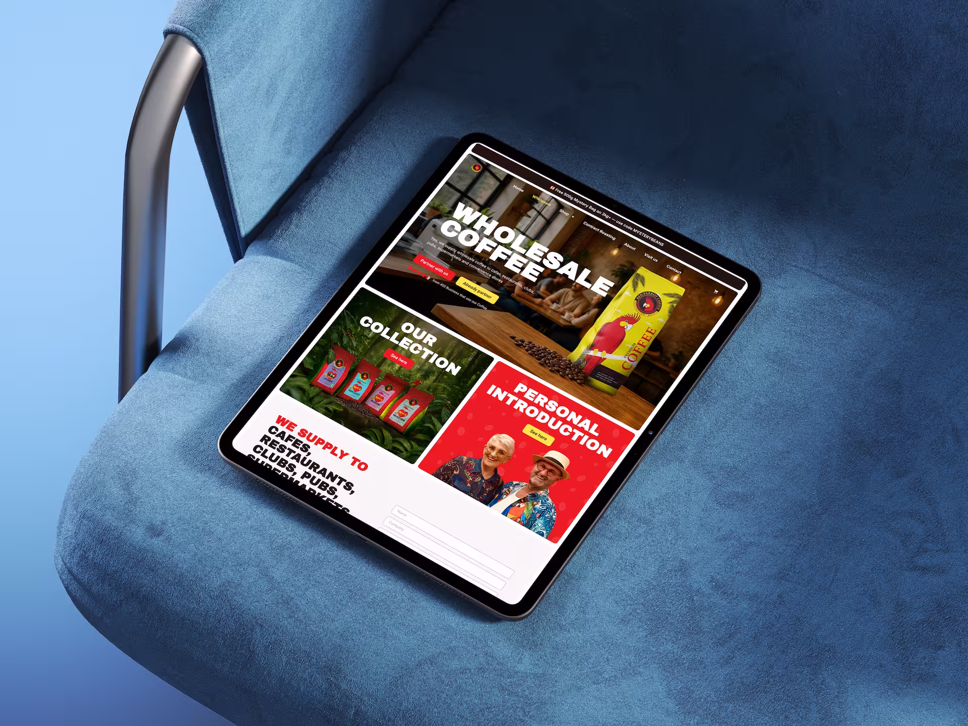
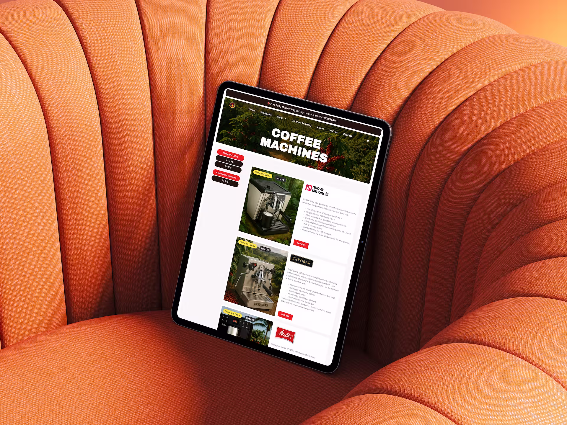
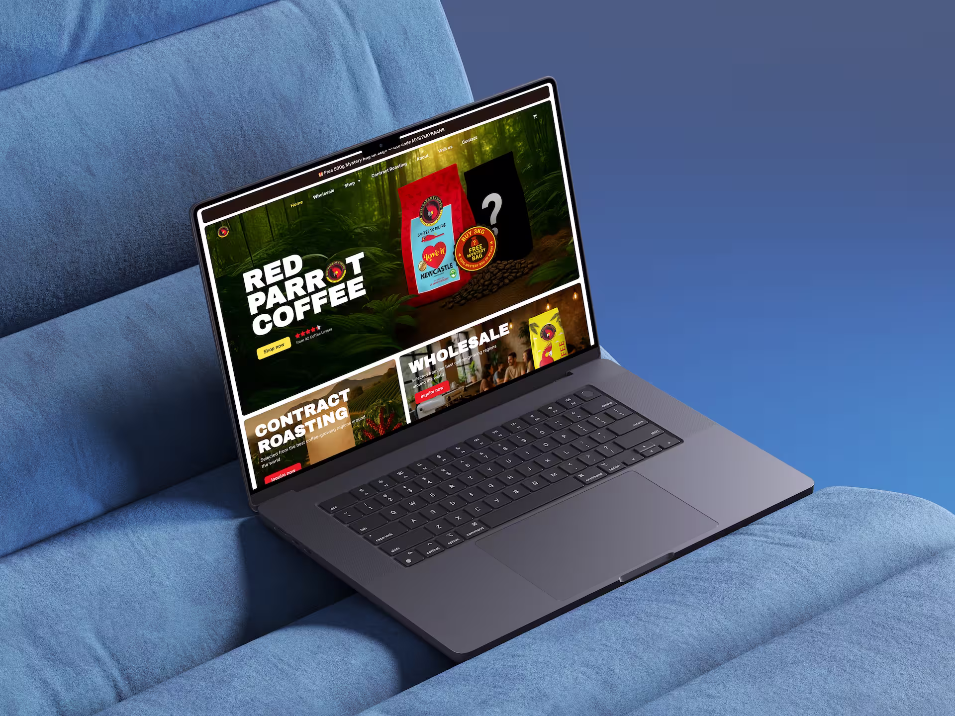
Red Parrot Coffee — E-Commerce Rebuilt for Clarity
The new site finally feels like Red Parrot Coffee again. It has their character, their energy, their warmth. Not that flat, disconnected vibe the old site had. Now everything just makes sense: you land on the site, you see the brand instantly, and you know exactly where to go. Browsing feels natural, ordering isn’t a puzzle anymore, and customers don’t have to fight their way through unclear steps just to buy a bag of coffee. The whole experience is calmer, clearer, and way more enjoyable — the way it should’ve been from the start. And for the team, it’s finally a site they’re proud to show and easy for them to manage without stress. It’s simple, it’s clean, it’s them.